
Install Steam
login
|
language
简体中文 (Simplified Chinese)
繁體中文 (Traditional Chinese)
日本語 (Japanese)
한국어 (Korean)
ไทย (Thai)
Български (Bulgarian)
Čeština (Czech)
Dansk (Danish)
Deutsch (German)
Español - España (Spanish - Spain)
Español - Latinoamérica (Spanish - Latin America)
Ελληνικά (Greek)
Français (French)
Italiano (Italian)
Bahasa Indonesia (Indonesian)
Magyar (Hungarian)
Nederlands (Dutch)
Norsk (Norwegian)
Polski (Polish)
Português (Portuguese - Portugal)
Português - Brasil (Portuguese - Brazil)
Română (Romanian)
Русский (Russian)
Suomi (Finnish)
Svenska (Swedish)
Türkçe (Turkish)
Tiếng Việt (Vietnamese)
Українська (Ukrainian)
Report a translation problem


 On Youtube


 2
2 


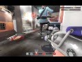
bland texture pallet, missing textures in certain spots, it looks incomplete and rushed, particle effects are random and out of place, cart is not all that great and makes little sense to the story you made, lighting is way too "singular", lastly the sky box and terrain is both incomplete and out of place
i get this was a very old map but maps like this should be used to show what not to do when making tf2 maps
- no-one knows where the cart is supposed to go - if you need a track idea look at my antimatter map.
- right flank from blue spawn has long sight line, put in another flanking route for blue to A point on the left from spawn
- cart doesn't have an outline for some reason
- the bridge in the hammers hallway needs to be enclosed at the archway so red can't shoot down on it from the roof - blue can't shoot up there because red can see blue and time their shots down - it's at 12:04 of your video
- the door at 8:56 should be see through and become a one way for blue at some point
- no forward spawns for blue
- In our test play, 90 % of the fight (blue/red on team switch) fought over point A tunnel. Blue felt like they were going nowhere and having a cart with no cover meant you can't use it for that.
- We'd love to play an updated version of the map - The map was a great effort!!
There isn't a skin for that, i did find a Blue & Yellow one but i think that brown darker colors fit more in that corner
@Giggimish
The size of the outside area is actually not that big, it might feel big if blue doesn't pass the first point.
@Catharfs
Heh, yes the last point is WAAAY too open, I'll start working on that area more when i get the time